Wednesday, 31 December 2008

Armatures

On the right is 1/7th Scale of anatomically correct human armature, which is what i've been working to, only DOUGIE's going to be atad different as he's not 'fully' developed yet, going throught the pubic stage though isit!?ayooo!

Ahemmm, sorry, Yeh so he's got fully developed hands and arms, legs and hips to add to his awkward looking adolesent figure, but he hasnt a fully developed torso, hense the severe smaller size of my scale drawing compared to the photo next to it.

Best get on and make it then.

Cheerio

So the pick-axe; I've been faffin with different colours, bright and colourful as poss. to try and make a nice aesthetic, sticking to the mechanical style as it's 'made' from nuts, bolts and piping. I do like the brassy sorta colour as it was stylised on a brass pipe, but i do love the red, hense it being singled out. So, i think im gona go with this.


Right, here's some colour tests for the foreman's/site hut and for the pick-axe. Gotta post up other props such as shovel etc but gona do that once i've made most of them, as its taking yonks to do!
I'm trying to get a 1950's aesthetic look to the hut, with its curves and circular components, Also trying to make it look battered and 'used' like you'd see it on a building site. I do like all the colours i've used, and i love the hut style sticking to the 1950's style and mechanical aesthetic im after, just gotta get the colour bang-on. Nearly there :)

Saturday, 27 December 2008

Here's some quick colour samples for the look of the 'set'. I've tried to keep it 50's, looking at caravans, cars fridges etc and the general colour scheme is quite "creamy" and thick, so i've tried to stylise the look of the "wall"-fence, on that. The middle pic is more mechanical looking, the pic to the left is more "modern" being an off white-magnolia as more building cites use that colour, and the pic on the right, is just an attempt at a 50's colour, which i do like as its not too contrasty with el sky.

Saturday, 20 December 2008

Here we have some "stylised" examples of tools/props in which Dougie may, or may not be using Here's the Hammer; i've tried to design all the tools with this "mechanical" feel. In this case, all the grips of the hammer's are coloured piping (right is copper esque.), for the weighty feel to a hammer, i.e bottom and head, i've designed pipe joints or connectors which screw on, like what you'd see all over the house, especially visible on radiators. The Hammer head is simply big nuts and bolts, and the 'nail removal' mechanism is a blade.

Colour Test

Here's afew examples of colour sampling for Dougie i've been doing. I really like the end two, to the right. They're quite nice, using orignal builder's colours and making them abit rustic they have a nice style to them.

Thursday, 11 December 2008

Erm, what started out to be prop designs (hense the shovels) turned out to be more designs for lil old Douglas. Ive been reading up about how to empahsize a character's age. One way is through posture. As Dougie's a teenager, ive been faffin around with his stance and posture to get a nice teenager dopey look, and teenagers like to HUNCH, so i DREW it (ayyyyoooo) i like him more now, has a nicer dopey-er look, as a teenager should have.

Monday, 8 December 2008

Here he is! Its DOUGIE!!...old school!...anyways, these am the latest designs...have been workin on the colour version, but i ay 100% happy yet...will post in due course!

Saturday, 6 December 2008


Sorry about the quality of the scanner...i obviously need a new un...anywho, after being inspired by ROBOT'S im beginning to wonder whether to research more about the 1950's colour scheme for things...as my film's sorta circa 1950's with the type of narration i want, and as the colours are really appealing from ROBOTS im gona have a butchers at old stuff to see whether the colour's will work for my character.

Friday, 5 December 2008


After readin' up on ROBOTS and watchin' the film several times, i really liked the colour of the sky, it has a darker rich blue toward the top, and it fades into this nice crisp sky blue colour, which not only emphasizes a happy abode, but it gives a good sense of distance...so i did me own version, its not all that, but its a start, oh and i put it as a BG to one of the photo's i took.

Thursday, 4 December 2008

Okey Dokey!

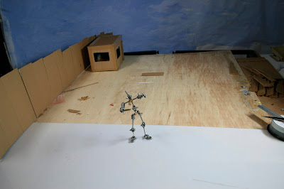
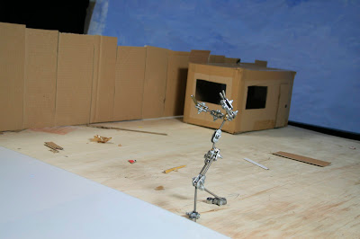
Here's just some test photo's in order for me to grasp a better idea of sizing.

I've taken a shine to a couple of the camera angles, so i'll prob use them which is nice...

As far as the set goes, it needs to be alot bigger (base wise), to emphasize a huge site, and dougie being so little in there. The "fence" kinda works, it gets smaller perspectively, hopefully showing a bigger field of depth.

The Porta-cabin, is a nice simple size, but it needs to be alittle smaller, to add to the field of depth aspect.


Tuesday, 2 December 2008

These are the latest designs for wee Dougie!

I'll post up some colour ideas and samples, when i get around to doing them, with a detailed description of why i've designed him this way....

I cant be bothered to type at the mo. soz n that

These are just some of the poses i presume i will use when i officially start animating, was just seeing if the shape was looking ok

Here's some more...
Here's a more recent sketch, i much prefer his "puppy fat", its starting to take abit more shape.

Sorta going back to basics...read through DOUGIE's personality/characterisitic sheet and decided to flesh his abdominal region out abit more...emphasizing "Puppy Fat"

This design sheet isn't the latest, but its to highlight the progression towards the later ones....
skecthes at bottom ideas are best to highlight the sort of feel im after...


Again, here's another example of colour aesthetic, i don't want the "robotic" appeal, but the mechanical style is splendid!

Was looking for inspiration, and im suprized i've only just thought of this but, ROBOTS is an extremely good example...As far as the Mechanical style and colour goes its just the sorta aesthetic i am after, just bought the ART OF book so gona have a lil jizz sesh over that...ziiing!

Friday, 28 November 2008

Dougie's Dig

Here's just a timing test for a digging style i've had a bash at...i could have done alot more to/with it, but i decided im not a fan of this technique, it needs to be more absurd...or un-orthodox....its probably compressed wrong knowing me and computers...take a gander anywho; love x

Friday, 21 November 2008


Idea of having really thin scrauny legs, big ('nobbley') knees, high tight little shorts (work-man esq.) highlighting a funny, soft appeal for Dougie...


More ideas based on previous image...

Really like the head...

Do to DOUGIE's mechanical look (not robot) i want my sets/locations/scenery/props, to all have this stylized look, ie Nuts and bolts/pin-rivets for the out housing of Foreman's Hut, House, etc...Shovel, made up of bolts/scrap metal things like that


The top right of the image, there's more of the head that im after, more stylized. Flick of 'hair' which could also be the peak of a hard hat, mixed into one, (influenced by Comiskey) with ridges again, acting as stylized hair/hard hat...


Here's the frist couple of character designs i did, wanted the 'mechanical' stylized look showing visible joints as he's a hard working 'tradesman' esq figure.

Tuesday, 11 November 2008

Testing, testing 1,2,3